The results were very encouraging. The simulation was left to run in multi cycle mode in batches of 10 trials of 444 month runs at a time giving the stats when necessary. The program logged the results to a file and I graphed the results in a spreadsheet program.
The results of the simulation are shown in figs. 24, 25, 26, 27,27a, 28, 29 and 30.
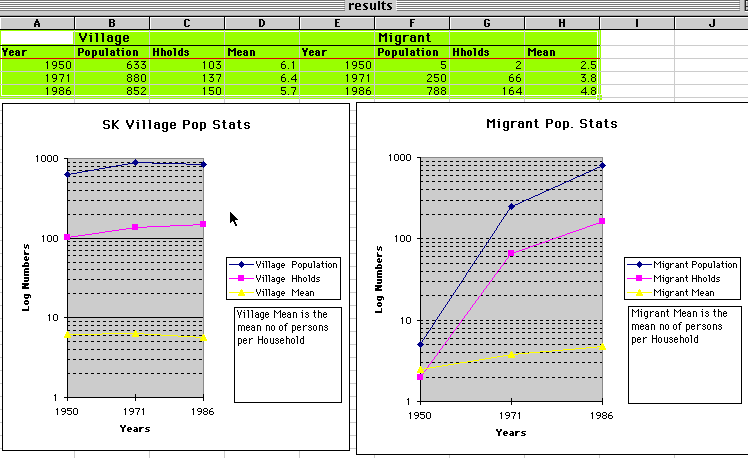
This graph shows the index data from the census material. It shows the growth of village and migrant populations, the change in the number of households within the village and those who have permanently migrated & the average number of household members in each situation.
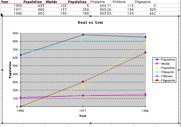
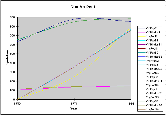
This graph shows the spreadsheet calculation background and a chart with the simulation results and census results together. One can see that there is a very high correlation.
Population (Village population), Hholds (Number of village households) & Migpopulation (No of migrants leaving) are from the census data whereas Vilpopsim & vilhhsim & migpopsim are the same variables but from the simulation.
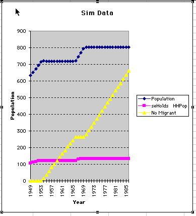
This graph shows a typical simulation result.
Population of the village; no of households in the village and the number of migrant
leaving the village. The second 'jump' in the village population is due to the 'diversification
of the base economy in the early seventies'. The effect was the same as decreasing
the amount of land per household needed before migration was necessary.
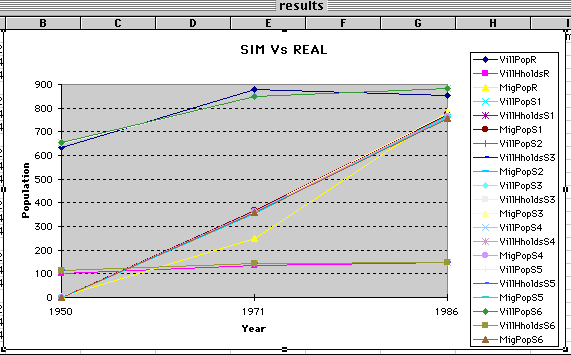
These graphs again show the exceptional correlation between the simulation results
and the census data. Fig. 27 is smoothed whereas 27a shows the point data. The fact
that birthrates can swing from 2 % to 7% with little change in the overall effect
demonstrates the stability of the system with regards to these variables.
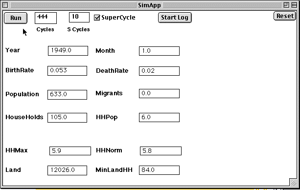
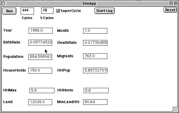
This is a print out of the Simulation frontend and 1950 initialisation parameters. The web site version will look much the same and allow you to run these results and test for the effects of changes in the initial conditions.
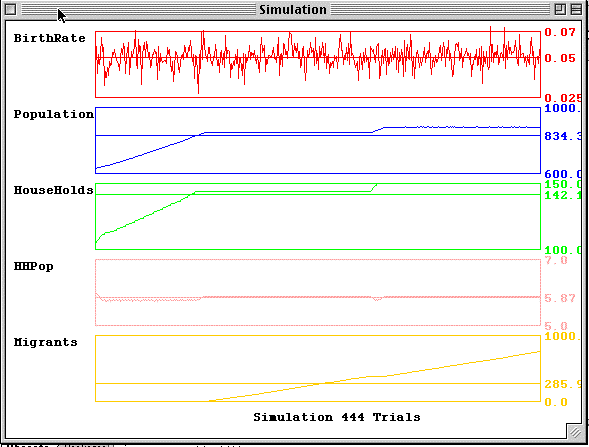
This is a typical endstate of the sim after 444 trials. It show the final population statistics for 1986 given the values set in Fig. 28.
This is a printout of the screen graph results. Notice the 'steps' in the population
ramps. This is again the correction needed to replicate the census data. It can only
mean that the economy had diversified and / or the land was more productive.
Fig. 31
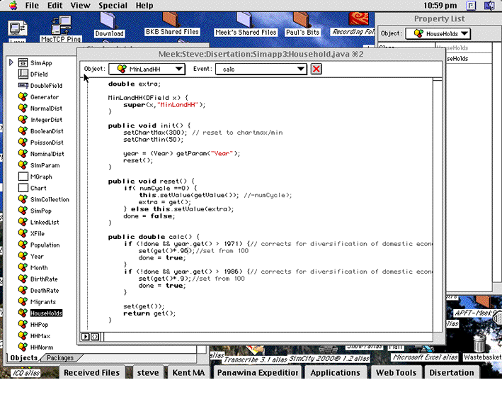 This
is a screen dump of the Symantec Visual Java development environment from which the
simulation was built/
This
is a screen dump of the Symantec Visual Java development environment from which the
simulation was built/
Notes from the research log as pre-conclusion!
"I can get the formal model, which is based on Stirling's model, down to a small number of aggregated variables, constants and processes which approximate or correspond with the phenomena I am looking at. From an analysis of the ethnography I could build an elaborate model but as far as migration is concerned I would still only need about 5 variables & constants if I was just interested in getting similar results. Those variables & constants however hold within them a countless number of others but there is very little overlap between their domains. looking at what really matters here. Its not perfect but it shows the general trends. In this case the two dependent variables are 'number of people per household' - constrained by the mean 6 & the 'amount of land available to the household'. One is a 'physical' variable and the other is a 'cultural' variable and they interact. Here we can see how they interact. One question now for the anthropologist is "Why is 6 so important?" "What does that tell us about the household structure?".